CONCEPT / REBRANDING / MOTION
This project was all about creating a retail “brand of the future.” I chose Ikea. While Ikea is popular and a leading global furniture retailer, there are many pain points about shopping at Ikea. My primary focus was to create a better shopping experience and bridge the gap between online and offline shopping.
There were four problems I identified as most crucial. It’s difficult to navigate through the store and locate products. Shoppers are provided with pencil and paper to write down product IDs of items they see in show rooms then search for it in a massive warehouse. Checking out is a bad customer experience due to long lines. And the only way to find out about product recalls is by checking their site.
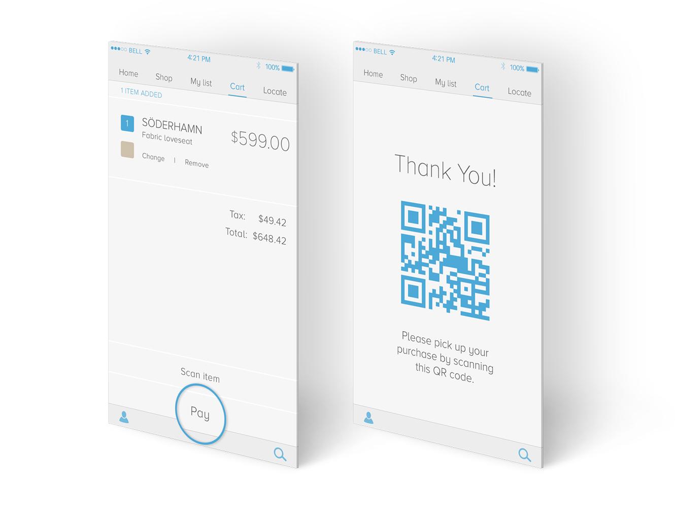
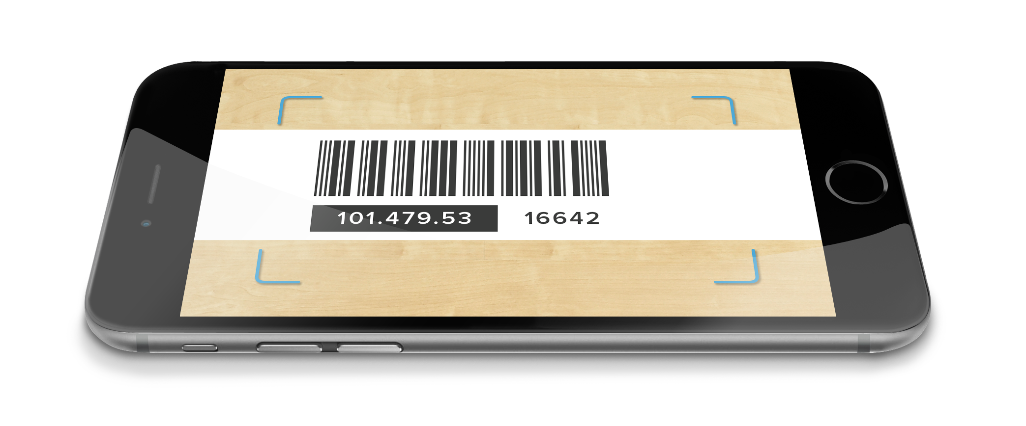
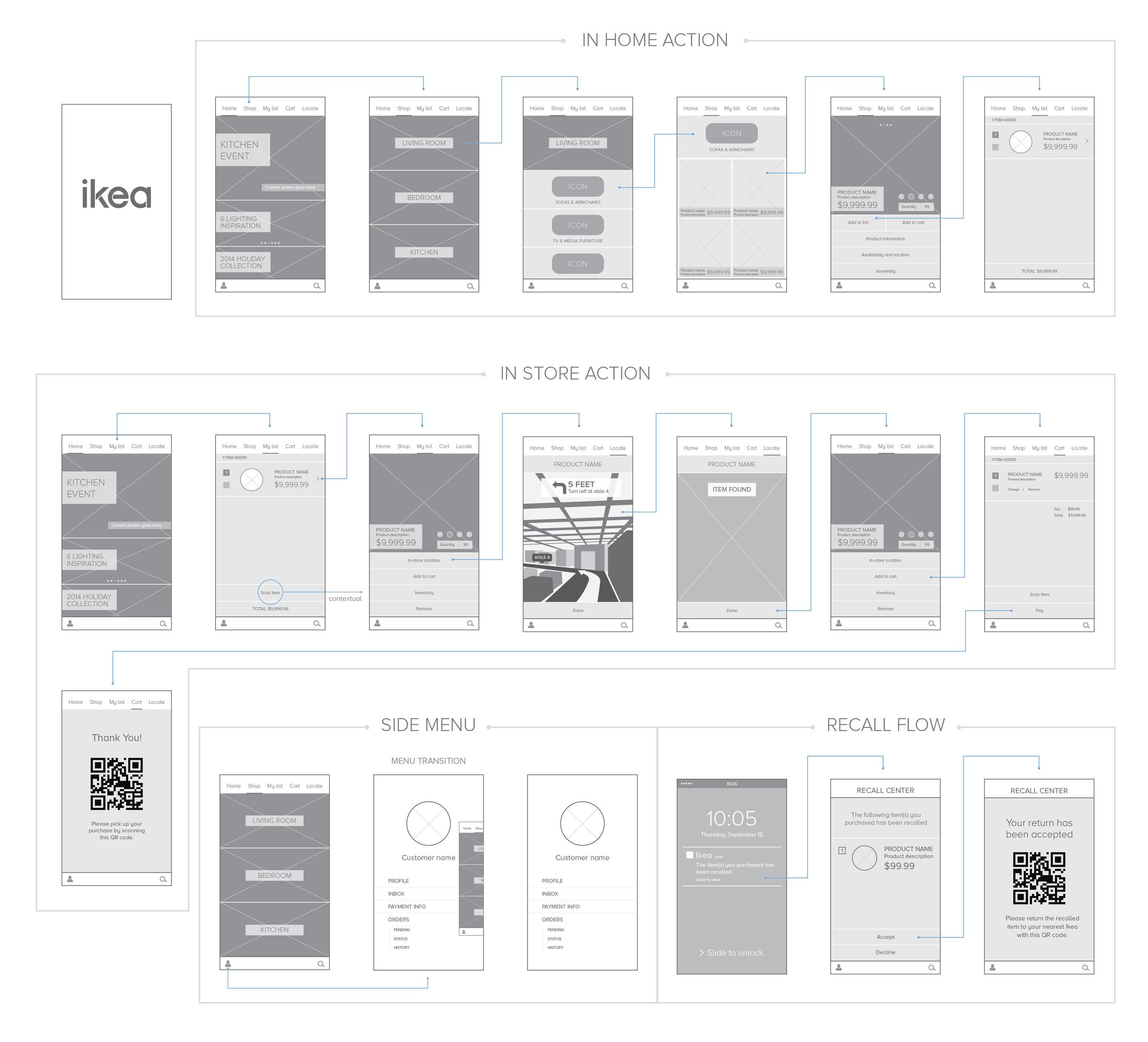
A feature in the app for indoor GPS to help shoppers locate products and navigate through the store. Replicate online shopping experience in the physical stores. Items can be added to the app cart by scanning bar codes. Payments can be made directly in the app. Items will be pulled and ready to be picked up at the end, similar to Curbside service. Purchase history can be used to directly alert customers with recalls.
With beacon technology, users will get contextual options based on their location. For example, the option for in-store location of an item is only available when the user is in the store.
According to my survey, one of the biggest complaints about shopping at Ikea is long lines at the register. My solution will allow users to pay in the app and pick up their merchandise on their way out.

Scan functionality will allow users to add items to their app cart and also view product information.

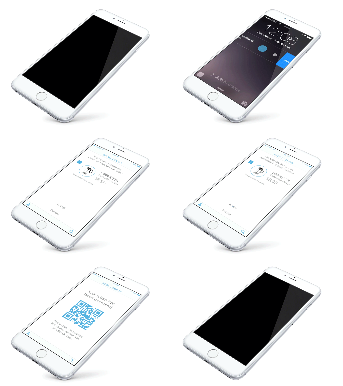
Product recalls can be alerted via push notifications so that consumers can take action right away.


Ikea walkthrough from kelly kim on Vimeo.